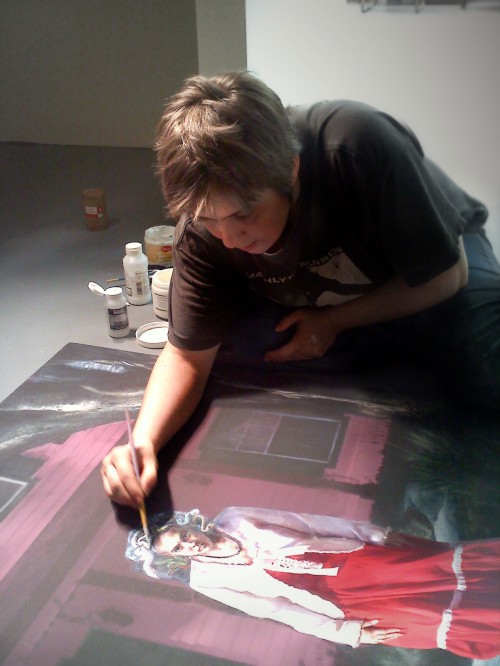
MANDEM (Maize Arendsee and Moco Steinman-Arendsee), Collaborative Artists
 In its last issue, Lunch Ticket featured an image by MANDEM—a collaborative team that includes Maize Arendsee and Moco Steinman-Arendsee. Intrigued by their work and process, Visual Arts Editor Ashley Perez decided to run an interview with the pair in the current issue. MANDEM describes itself as “Mythpunk,” a moniker that combines “Steampunk” (a retro-futurist arts subculture) with “myth,” in reference to MANDEM’s unorthodox and imaginative incorporation of classical mythology into its imagery.
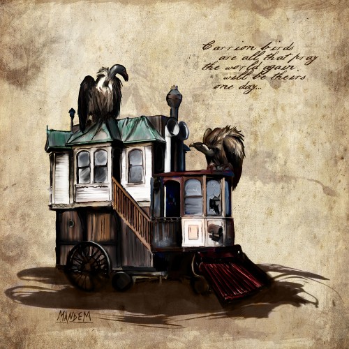
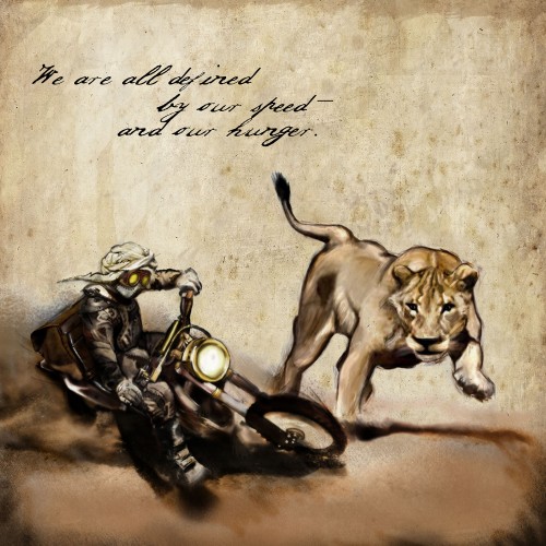
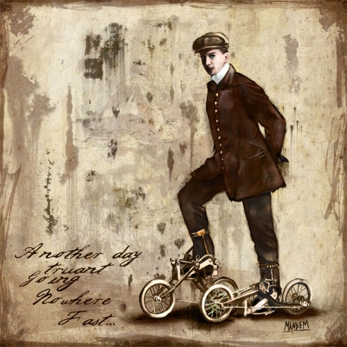
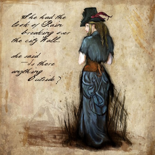
Our interview with MANDEM features several works from their Notes from a Time Traveler’s Journal series. More MANDEM art can be viewed at www.mythpunk.com.
MANDEM won first place in the Nationwide Spooky Art Contest; “Best in Show-Expression” at the 2012 DigiTech Showcase, and won Fine Art America’s “Digital Goddess” Art Contest, among other awards. Recent exhibits include the Southern Humanities Council Conference (2013); Westcott Gallery at Florida State University (2012-13); CoCA/City Hall Art Gallery, Tallahassee, FL (2012), and the Fountain Art Fair (2012).
The two collaborators of MANDEM were interviewed by Audrey Mandelbaum and Ashley Perez via email in March, 2013.
Audrey Mandelbaum/Ashley Perez: Who and what is MANDEM?
MANDEM: MANDEM is the artist name for Maize Arendsee and Moco Steinman-Arendsee. Our working process is highly symbiotic and as the artist MANDEM, we achieve more than the sum of our parts. Our work has appeared in literary and art journals; on book, magazine, and album covers; in roleplaying and board games; and in many dozens of art galleries. MANDEM’s work is a transdigital exploration of metamorphoses, multivalency, and anachronism. We have an interest in destabilizing genre — both in terms of content and medium — drawing heavily from our personal identities as queer feminists. Our subject matter is liminal, featuring characters of uncertain biological identity, blurring the lines between genders and between humans, animals, and machines.
Of course, we would be remiss not to mention that our long-time duo is now a trio. We have a two-year-old daughter, Kitsuko, who has been dubbed “The Littlest MANDEM” by some of our Internet followers, and she’s increasingly becoming an integral part of our artist experience.
AM/AP: We love the “Notes from a Time Traveler’s Journal” project. What were you thinking with this work?
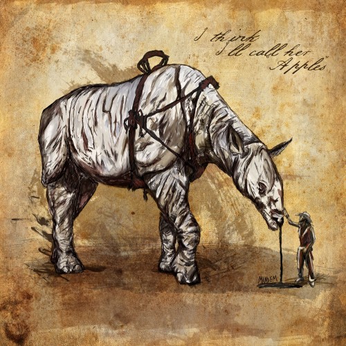
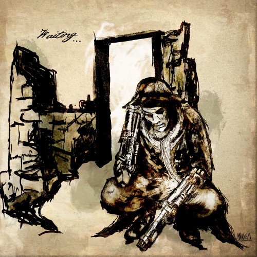
M: We began the first images in this series as part of working on Abney Park’s Airship Pirates universe. (Editor’s note: Abney Park is a Steampunk band based in Seattle. Abney Park’s Airship Pirates Universe is a RPG and Board Game based on the band’s songs.) However the series itself quickly expanded beyond that. The addition of textual elements turned a collection of disparate images into a cohesive set of “notes” from an apocryphal journal. Our concept was to create fragments of a non-reconstructable narrative that invited the viewer to imagine a complete narrative and try to piece it together. But ultimately they can’t be put into a definitive narrative; each person will have their own version of the story.
This mirrors real history — we all think that we have a complete narrative of history, but the closer we look at individual experiences, the more the meta-narrative of history loses cohesion. We are all time traveling from a past that will never be the same as we left it — if we were even able to go back, we would find that it never existed as we remember it now. And we are all transgressing into a future that is not what we thought it would be. And even this present moment in time may or may not be as we perceive it.
When this series goes to art shows, we “age” the paper by hand and catch them on fire, so each one looks like it was torn out of a burning book. We mount them on archival board – ashy tatters and all – and put them into shadowbox frames, so there’s an illusion of a preserved document, barely saved from some great disaster. It’s a nod to archivists, without whom we wouldn’t even have the illusion of knowing about the past.
AM/AP: These pieces remind me of the work of Goya’s, the 18th century Spanish romantic painter and social critic—in particular, the style reminds me of his series of prints, “The Disasters of War.” What aspects of your work do you consider to be a form of social criticism?
M: Oh, wow, that’s a huge compliment.
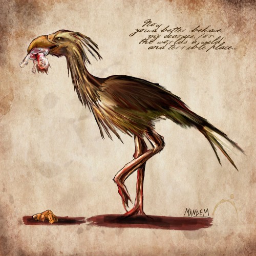
Well… The “Time Traveler” series alternates between levity, gallows humor, and social criticism. Take “Neverbird”: On the one hand, it’s a black joke about storks delivering babies, but more seriously …taking the text into account… it’s a criticism of the horrors to which we intentionally subject our children. Parents so often terrorize or harm their children in the name of creating social compliance. On another level, though, it’s also an expression of natural parental fears about the vulnerability of one’s children to the terror of the world.
There are a variety of ways that our wider body of work is intentionally a social criticism. We often work with imagery that would be considered fantasy/sci-fi (though we prefer “fantastic realism” as a descriptor of our work), but this genre of art has a history of being both very sexist and exclusionary of minorities. (Think of the sexual and racial dynamics of Frank Frazetta’s work, for example.) This is particularly problematic because fantasy and sci-fi, as literary genres and conceptual realms, have been very important to a number of minority groups, including the LGBT community. This makes sense because people who grow up feeling alienated in the world are often drawn to these fantastical stories of the ultimate Other, the magical Other, and to the idea of different types of worlds and societies in which they might not be so radically alone. Some of the earliest feminist writings were science fiction, ranging from Mary Shelly to Charlotte Perkins Gilman. So we’re intentionally working to create queer, feminist art in an area that’s resistant to this approach, but at the same time a very natural home for it.
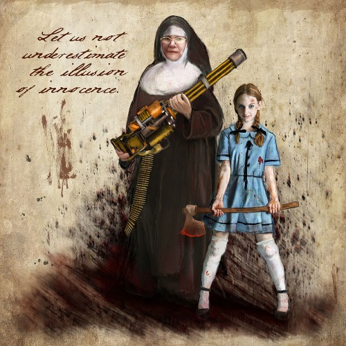
AM/AP: Another piece from the “Time Traveler” series, “Beware the Innocents,” depicts a nun and a young girl in tattered clothing that dates back to the 40s and 50s. Both figures wield weapons. It is perhaps an image of the disenfranchised taking revenge. But, there is also the sense of the two figures representing religious authority, or normative ideas about charity and innocence, which is then turned on its head by the violent aspect. One is not sure whether to root for these characters! Are they good? Are they evil? Were they good once, but using violent means to defend themselves? Can you tell us more about this piece?
This was one of the first of the series, actually, so it’s the most strongly related to the Airship Pirates universe in its original inspiration. The titular song (“Airship Pirate” by Abney Park) from which the story expands outwards, tells the story of a mercenary band attacking what they believe to be a merchant ship, but when they actually take it down they are horrified to discover that the ship is in tatters and “a look below deck shows a crew of nuns and orphans!” The story functions as part of the entire larger narrative (which involves struggling to re-write history–or re-right it, I suppose) about the unintended consequences of heroism. But this piece was a slight tongue-in-cheek response, which by all reports had the original author of the song in stitches.
Of course, on the one hand you’re also correct that its inception stems from a more serious concern that’s in line with our larger critical approach with feminism and also with the reliability of narrative. The song uses “nuns and orphans” as a one-liner to suggest that it turns out that the ship is peopled with helpless non-combatants… and this asked “well, does their age and gender really imply that they’re helpless? Why shouldn’t women and children be able to fight back?” I like to turn expectations on their heads, and question assumed roles. It’s all part of the way that illustration—at its best—can contribute to the complexity of a story, creating questions about the reliability of the narrative, the nature of its reality, and so forth. MANDEM shouldn’t be trusted with a straight-up illustration in most cases; we end up queering things.
AM/AP: Steampunk culture is a big influence on your work. Can you describe what it is, and what about it appeals to you? How about classical mythology?
M: Steampunk is one of the manifestations of retrofuturism in our work. More specifically, Steampunk is retrofuturism based on the steam era of technology, i.e., the Victorian era.
Retrofuturism is any vision of the past that includes futuristic elements or ideas of the future that picture it recreating the modes of the past. So, for example, if a modern person writes about Victorian space travel, they’re doing retrofuturism. We’re fans of retrofuturism because it allows people to use what they know about the past to make commentary on the future in a way that’s more accessible, and likewise to use what we know about the present to make a new kind of commentary about the past. Because retrofuturism is fantastic and “not real” it can slyly bypass some of the political defenses that people have in place when it comes to talking about issues. You can see this in action with the massive impact that a retrofuturistic movie like V for Vendetta (The 2005 film based on the 1982 graphic novel by Alan Moore and David Lloyd) had on the Occupy Wallstreet movement. People who might not have been able to notice problems in our society could recognize the parallels in a fantastical universe and became motivated to adopt the emblem of the fantastic struggle into their real struggles.
Regarding mythology, that’s actually the focus of Maize’s undergraduate work—classical civilizations. Her undergraduate honors thesis was on the Minotaur myths, and she’s still engaged academically on working with comparative mythology. It is extremely common for our pieces to have subtle (or blatant) references to mythology, though not exclusively Greek mythology. We actually characterize the majority of our work not as Steampunk but as Mythpunk. When we say mythpunk, we mean a sort of retrofuturism that, instead of drawing from a specific era (like the Victorian era), takes place in diachronic time. Diachronic time is a sort of nonlinear/cyclical, archetypal time that exists in myths and in universal stories. It can take elements from everywhere, and what’s important isn’t so much the time stamp on the elements, but the way that they all participate in the same relationships.
AM/AP: What are your other influences: from art, but also film, literature, or other genres?
M: We’re very interested in the visual aesthetic of Film Noir and German Expressionist film. We enjoy magical realism (e.g., Joge Luis Borges). We’ve been influenced by continental writers of the early- to mid-20th century, like Brecht and Herman Hesse. Various subcultural musical movements are also a big influence, and anywhere we might find compelling stories about the Other.
AM/AP: Walk us through your artistic process from idea to finished product.
M: This would be a good time to mention our overarching philosophy for art projects, which is something that we call a transdigital aesthetic. We feel that there isn’t a value differential to be placed on digital or traditional artistic techniques, so we use whichever has the effect we’re going for in a specific piece. We’re very willing to switch between physical and digital media, so for example, we’ll print something out if we want to add physical media, and then scan it back in if we want to do more digital editing. The workflow for any individual piece is going to vary depending on the end goals and how it’s going to be published. For example, the Time Traveler series is almost entirely digital in the versions that go to print in books or magazines, but when they hang in a gallery only the outlines are done digitally, then they’re hand-painted to add color, and the lines are enhanced by hand with ink, then they’re distressed and burned.
The painting we’re working on right now (“Medusa, in Her Sunday Best”) is very photorealistic in sections, so we actually started with costume design, then a photo shoot for reference photos. We then did a photo-manipulation of the source images to make a rough collage to work from, then did some digital painting, then printed that on colored paper and painted directly onto the paper with oil paints. We then scanned that back in and did digital painting for several of the sections, and did some digital editing on the parts that were physically painted, which created a complete, ready-to-publish digital version of this painting. But we still needed to create the version that could show in galleries, so we actually digitally removed large sections from the image we’d just finished, then printed out what remained on a large format canvas.
But this is just the process for one specific painting. Other pieces are entirely digital or (more rarely) entirely physical media.
AM/AP: You describe yourself as a collaborative team to some extent, and you’re also a couple, and now parents. What in a nutshell do each of you do, and how did that collaborative relationship evolve?
M: We’ve known each other forever. We’ve been a couple for over 15 years, and neither of us can remember a time before we were artistically collaborating. We were introducing our imaginary friends to one another and writing stories together from the beginning. As we evolved into visual artists, our working method remained much the same, brainstorming and birthing ideas together, but Maize is the one who does the “brush on canvas” (or “stylus on graphics tablet”) work. Moco manages the printer and stretches canvases, and often models if we need photo references. While Maize paints, Moco will stand by to help make color, material, and composition choices (and to refill Maize’s coffee). The relationship is a little as if Botticelli’s muse Simonetta had stripped off her fancy dresses, put on a smock, and come into the workshop to mix his paints and make composition choices. As for Kitsuko, she tells us if our work is “hot!” or not. If she doesn’t call it “hot,” it’s missing something.
AM/AP: In contemporary art galleries and museums, you don’t see a lot of figurative art these days, especially work that incorporates elements of fantasy and myth. We want to know more about your take on the role of figurative and myth-based art today.
M: I think it’s making a resurgence, slowly but surely. Figurative and myth-based art has never gone away, it just went underground.
The thing is that museum art is very political. Museums are political. They reflect the interests and tastes of “the powers that be” in a way that is often not recognized by academia or the general public.
There’s a widely accepted meta-narrative of art history where abstract art rose very naturally and fluidly out of the European art scene that existed before it. You had the impressionists, and then the cubists, and then abstract art… and just one thing lead to another in the natural genealogy of art. And the implication is that these changes reflected changes in common taste, but this isn’t the entire picture. Abstractism’s total conquest of the museum system was not so much a matter of changes in public taste as it was a matter of changes in politics.
This is very well documented, by the way—I’m not speaking of a personal paranoid theory! When the Cold War began, the Soviets were championing and funding realist art; they were very strict realists. And so “our side” of the Cold War generated and publicized an idea of the free capitalist artist as a non-representational artist, and this idea of abstract art as capitalist art, essentially. They developed this alternative, and funded it heavily. You literally had money from the CIA going into funding art shows, along with the old money Americans who were funding museums to show abstract art.
But at the same time that the government was investing heavily in abstract art, the most popular artists in America—the ones that were appearing in every home—were people like Maxfield Parrish… who of course was doing figurative fantastical art. At the same time the “high art” bloc was condemning figurative artists, and especially fantastic artists like Parrish, as “just illustrators.” So you have the Norman Rockwells and the Andrew Wyeths being hugely popular among the people of the time, and roundly dismissed by the formal art world. And it wasn’t just the realists of their own time that this new academic art rejected.
But now, at this very moment in art history, people are going back and discovering “illustrators” like Rockwell and Parrish and working to restore their legacy, reevaluating them as artists, and curating them in museums. Part of this may be a conservative backlash coming from individuals who don’t realize that abstract art was conservative in the first place, but I also think that part of this re-evaluation of figurative art and mythic art is very much a meta-modern return to complicated sincerity, narrative, and beauty. This is a return that doesn’t denounce abstractism, but just has a bigger art umbrella—takes it all in.
And of course there have been a few recent high profile shows of classical fantasy artists and of comic book artists, so I also think we’re starting to enter a time where the postmodern ideal of a collapse between high and low art is not just theoretical. We’re starting to admit that a theoretical position like that necessitates an embrace of both “high modern” painting and also the figurative art that the majority of the population has always loved.
AM/AP: Maize, you entered a Master of Fine Arts program recently, is that correct? What’s that like for you, as a working artist, to be a student again?
M: Brutal.
For many years, Maize was a self-taught artist, and it was an important part of her identity that she was a self-taught artist. She also identified as an academic. She went to graduate school for something other than art; she got her Master’s degree in interdisciplinary humanities with a focus in critical theory.
We naively expected that art school would be similar to her past studies, except with painting instead of essays, but it’s turned out to be a totally different world socially and in terms of a meeting of aesthetic minds that aren’t always in synch with one another. The good news is that going to art school is giving her the opportunity to work with some absolutely amazing professors with whom she does have a strong aesthetic connection, and she has definitely learned a lot about physical media, which she had not previously been as comfortable with as the digital media. In particular, Maize has been working with Carrie Ann Baade, who is an incredible Visionary Artist who tends to show with pop surrealist artists, and Lilian Garcia-Roig, who does very textural landscapes with such thick paint that we really don’t understand how it adheres to the canvas.
In the meantime, our actual art career is going swimmingly — we have more publication opportunities than we can keep up with. It’s an odd dichotomy to try to balance a professional career, in which self-confidence is key, and a student career in which it can be a liability.
AM/AP: Thank you for your time.
Ashley Perez lives and writes in Los Angeles, California. She completed her MFA in Creative Writing at Antioch University. She is currently working on her first novel as well as continuing her second collection of short stories. You can see her thoughts on art and writing inspiration at http://artscollide.blogspot.com.
In addition to serving as Co-Editor of Visual Arts for Lunch Ticket, Audrey Mandelbaum is an artist whose work has been exhibited most recently at The Front Gallery in New Orleans. She coordinates the MFA program at Antioch University Los Angeles and teaches art classes in the bachelor’s program there.

